Not all websites are created equal and neither are their prices. In this blog, we break down what an affordable website design package in Singapore includes, what you should look for, and why it can be the smartest investment for your business.
How to design an attractive Brochure for your Business
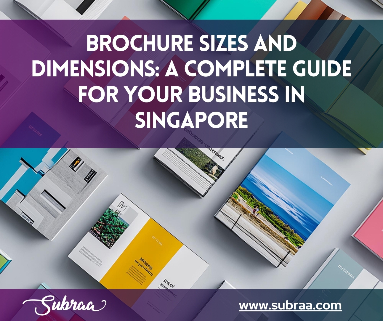
Brochure is the common and first marketing medium which strikes us when we are planning to drive some customers to our shop. A business like beauty salon is definitely in need of brochure, not just a simple design but a compelling design of their services offered would create an intuition in your customers to avail your services. Brochures can be of any size and can be bi folded, tri folded.
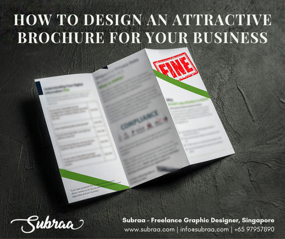
It generally contains images and information of a particular brand’s product or services. Brochures can be bounded or unbounded sometimes. Brochures are also made in the form of a flyer and can be either one side or double sided.
1. Bi-folded Brochure
Bi folded brochure as the name suggests has a single fold dividing it into four large panels. These panels hold information and images about a certain company. They are often used as informational brochures as they have a lot of space for content.
2.Tri-folded brochure
Tri folded brochure as the name implies has three folds that makes it into a 6 large panels. These are often used for approaching a larger target. They are suitable for hand delivery, mail, retail or showrooms.
In this article I have given a brief about only 2 types of brochure folds, however there are a lot more like classic trifold, z fold, single gate fold, four-panel fold, double gate fold etc.
So, how do we design a brochure with compelling design. Let’s go through the below simple steps to design an engaging attractive brochure for your business.
Step 1: Know what they want
Before you start to design a brochure analyse the business needs, speak to your client. Know what they need, how they would like to portray their business, what is the age group of the audience they are targeting etc. Put forward all the possible questions you have in mind and design for the audience and not for the business owner preference.
Step 2: Keep your audience in mind
Keep your audience in mind while designing every element of your brochure. If you are designing to distribute the brochure to random people on the road make sure you design it more colorfully so the passers by can get attracted by the attractive colors and may tend to read the services. The age range of your target audience should also reflect in your design.
Step 3: Use high resolution elements
All your design elements such as images, illustrations, icons and logos, typefaces and sharp color palettes should be in high resolution because you can’t get away with low quality elements when you are designing something for print. However, there is no exact specification for the quality of image you should use as they differ based on your project but we recommend to use 300 dpi or above images because anything below that will hinder your brochure’s quality.
Step 4: Use high textures
There are varieties of textures available to make your brochure look good. You can choose your suitable one from the following.
1. Foil: Using shiny letters to highlight certain portions of a brochure design.
2. Spot UV: Spot UV is applying UV coating for a specific area rather than the entire surface.
3. Letterpress: Printing that makes an imprint on certain parts of the design.
4. Folds: Bi- and tri-folds aren’t the only option, there are several types of folds available.
5. Paper: Paper types with different textures can set the tone of a project
6. Die Cuts: Removing portions of the plan so something different shows through makes a feeling of riddle
Step 5: Don’t forget to add Call to action button
Call to take action is the thing that you need your client to do in the wake of expanding your data from your pamphlet. Below are a few of the CTA texts that could help you determine what a call to action is.
- For any requirement Call Now immediately.
- Leave us a review and so on.
- Call +65 1234 1234 Now
- Get Started Now
- Register Now
- Register for a Cause
- Visit us
Ensure you feature your CTA with the goal that your group of spectators don’t miss it out.
Step 6: Be careful while choosing your colors and fonts
Colors and fonts are the major elements that comprise a brochure designing. Therefore, it is important to make them good. Colors and fonts can cause attraction or distraction, pleasantness or irritation so it very difficult as well as important to choose them wisely. Choosing the right color or font can be very overwhelming as they are plenty of choices, to overcome this you should have complete branding guide.
Font
Using more than 2 font typefaces can disrupt the flow of text in brochure and it can also cause to shift the focus of the viewers to the least important messages of the brochure.
Color
Choosing a color scheme requires a lot of work because it is necessary to know your target audience, company’s characteristics etc, before choosing a color scheme. Like using primary colors for children and neon colors for night parties etc.
Step 7: Use simple statements
After all, the main purpose of your brochure is to informate the people about your products or services. Therefore, instead of using fancy words in your brochure prefer using simple words that will convey direct meaning to the audience. Simple statements can make people feel comfortable while reading.
Step 8: Make sure there is no typos and simple mistakes
Typographical mistakes and simple design mistakes can make your design look unprofessional. Sometimes, it might lead to misinformation which might cause a huge consequences. So, always design with utmost attention and care. Before printing your brochure do a complete print proof 2 or 3 times to make sure everything is perfect.
Step 9: Correct spacing and grid system
There is also another way to grab the viewer’s attention to a certain text other than font sizing and highlighting, it can be done by leaving ample of whilte space surrounding it, this is because the more white space around something, the more attention it seeks. But never use white space for unimportant elements because it might mislead the viewers. Giving enough space will also increase the readability of the content.
Placing content randomly on your brochure can end up with a haphazard appearance that is messy. Grid system has been working since the invention of print medium. A perfect grid leads the way for the reader, it wouldn’t let the viewers to be confused with following the content.
Step 10: Go for quality paper if you are printing
All your brochure design efforts will go in vain if you print it in a low quality paper. We prefer to go with thick glossy sheets because thick sheets allow for more flexibility with color and printing techniques. Cheap printing may not go well with audience despite your effort to design.
Above steps are helpful when you design a brochure, however it is not always a rule to follow this exactly. Creative designs also works with audience still the base for creative designs are the above 10 steps. Subraa helps with affordable brochure designs according to client’s budget. Designs are always based on client preference with a quick turnaround time.
Are you looking for a Logo Design Singapore or Brochure design for your Company or Business, contact Subraa – Freelance Graphic Designer in Singapore, Call 97957890 or [email protected] and get your brochure designed at an affordable price in Singapore.
Interested to read more about the difference between a Pamphlet and Brochure:: Pamphlet and Brochure – Are they same?


