


Not all websites are created equal and neither are their prices. In this blog, we break down what an affordable website design package in Singapore includes, what you should look for, and why it can be the smartest investment for your business.
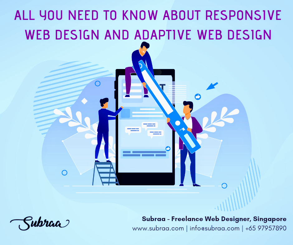
All you need to know about Responsive Website Design and Adaptive Website Design
Aug 12, 2019
Mobile devices can no longer be ignored, as technology grows customers tend to view most of the websites on the go and the usage of mobile and tablets are on the increase. Freelance Web Designer in Singapore tend to develop the websites to be more compatible to devices and it is a default feature. The rise of technology has shrunk everything. From a room sized computer to a smartwatch that does almost everything. So the bigger question comes in, “compatibility”. To overcome this and bring compatibility to the web, two types of designs were introduced and they are Responsive website design and Adaptive website design.
 Responsive Web Design and Adaptive Web Design – Subraa, Freelance Web Designer Singapore
Why compatibility is important in web designs?
Although mobile users have become predominantly higher than the desktop users. There are a lot of people who are still using. The emergence of ipads, tabs have made it difficult so one size fits all cannot be possible. There are also display size variance in mobile phones, therefore it is important to design separately for most of the popularly used mobile phones.
People use different browsing platforms such as Google Chrome, Mozilla Firefox, Safari, or Internet Explorer and each platforms display websites in a different way, hence it is essential to create a versatile design that will work well in all platforms.
Compatibility can provide a good user experience and an optimal web experience to the users. A good design should provide a good navigation no matter the platform they use. You might lose a potential customer if you don’t have compatibility.
The confusion
The boundary between the adaptive web design and responsive web design may be blurred, so there has always been confusion in choosing between the two. However, there are few obvious differences that thickens the blur and make it visible. First let’s look at the definition of the two web designs and then let’s look at the differences.
Adaptive website design (AWD)
AWD is a Graphical User Interface (GUI) that is used in websites to make it adaptable to different size screens. AWD uses a set of predesigned fixed layouts and then choose the best match for the current screen size.
Responsive website design (RWD)
RWD is a design that makes the web pages to render well on any screen size, platform or orientation. This type of design consists of a variety of flexible grids and layouts, images to suit different sizes and platforms.
Compatibility is the similarity
In adaptive design, a different website is created for number of largely used devices to suit different screen size and then it is loaded to the users accordingly. Whereas, responsive design can adapt to any device,platform and device orientation because it uses CSS media queries to make it versatile and adaptable according to the target device. Websites should be created either responsive or adaptive because only these types can provide compatibility to the website.
Difference between Responsive and Adaptive Web Design
The purpose of both responsive and adaptive web designs are the same, but the way of doing is the only difference between them.
What is the purpose:
The purpose of both the web designs are to provide ease to the users in all the platforms and in all the devices. Because the display size varies for devices and therefore it has become very difficult to follow one size fits all the method, that is the reason for the invention of these two web designing methods.
What is the difference: To put it metaphorically
Adaptive design is like an expandable dress that can fit any size from very thin to gigantic fat, but responsive design is like having a variety of dresses in all sizes to fit anyone.
The real difference
The difference between adaptive and responsive is that responsive design alters the web page according to the viewer’s screen for easy usability, whereas the responsive design have a predesigned fixed websites that can fit a variety of screen sizes and it selects the nearest or the exact suit for the viewer’s screen.
Which to use:
Responsive design have break points where the content can break depending upon the user’s screen size. These breakpoints are like checkpoints that checks and scale texts, images, layouts to fit the website into the screen. Whereas, in adaptive design the user experience varies because the website is designed differently for different screens. Adaptive web design is based on number of different screen widths that vary from 320 pixels for a smartphone to 1600 pixels for a desktop computer. In adaptive designing it is not possible to design for all the sizes therefore they rely on web analytics and design for the most used sizes. However, responsive design is the most preferred choice but adaptive is also used by many designers who wants to have full control over their websites. Then, The ultimate question comes in
Which is better?
Well, to know the answer for that you have to take a step back and look at the bigger picture and find out your purpose, needs and your target.
Uses of responsive website design
Search Engine Friendly
Google prefers responsive designs over adaptive designs due to its mobile friendly usability. Responsive designs are accessible from all devices in a similar format and same content and this compatibility increases the user experience and that is what is the google wants for its users therefore Google prefers responsive designs.
Easy Implementation
Responsive designs takes less work to build and maintain a site when compared to adaptive designs and also the majority of the free word press themes are available in responsive designs as they are easy to design. In responsive design, the website designer needs to design only one layout and it can fit in all sizes but it also costs something in return, it is the loading speed of the site and also sometimes it fails to deliver the optimum user experience.
More Visitors
As the responsive web design can fit in any sizes, this implies that the design can be used in all web browsers and all devices. This enables the visitors to visit from any browsers and by using any devices. This will adversely bring a lot of visitors to the site as it is very usable and compatible.
Uses of adaptive designs
Target visitors
Adaptive designs mostly rely on data. These data can be used to find out who is visiting your page and which browser and device are they using. When designers know these information they can use it to target their visitors and design according to them. This inturn will provide improved user experience to the visitors.
Speed
Web designers who want their website to be loaded fast will use adaptive web design because they are 2 to 3 times faster than responsive web designs. This is because adaptive web designs send less data to the user’s web browsers to deliver content.
Good for upgrade
Adaptive web design allows progressive enhancement for a website. It is best for upgrading older sites because it starts with the existing contents progressively enhances the sites by adding more features. So, this allows the devices that does not support the upgraded design to view the existing essential content and the devices that allows the upgraded design can view the enhanced site.
The above are the uses of both the web designs, it is necessary to know your requirements, audience and purpose of your web design. Although, both web design’s goal is to achieve compatibility, you have to choose for yourself from these two and decide which is compatible for your purpose. However, as a professional website designer recommend using responsive web design because they are well suitable for all screen sizes and today there are smartwatches to the desktop computers so it has become very difficult to design individually for all of them.
I hope this article gave you a clear understanding and the uses of both the web designs and also the difference and the similarity between them. Now, you can choose either of them according to your uses. If you are very confused about what you want, then I would recommend you to use responsive web designs as they are very compatible as well as easy to design. If you are looking to hire a freelance web designer Singapore, contact Subraa at 97957890 or email to [email protected] today.
freelance singapore, freelance web designer, freelance web designer in singapore, freelance web designer singapore, web design, website designer

01 Oct 2025
Tags: Tips and Tricks, web design, web design package, web design tips, web designing, website design package

26 Sep 2025
Choosing the right brochure size is key to making a lasting impact. In this guide, we cover standard brochure dimensions, folding styles, use cases, and printing tips—specially tailored for businesses in Singapore.

22 Sep 2025
Your website isn’t an accessory; it’s the core of your online presence. Small entrepreneurs, business owners and marketers investing in a professionally developed website can be a game changer. With so many pricing options available, an issue is often asked about the cost of a website design in Singapore.
About Me

I’m Subraa, web designer, logo designer, Digital Marketer based in Singapore
-
Recent Posts
- Website Design Package Singapore: Cost, Features & Benefits Explained 1 October 2025
- Brochure Sizes and Dimensions: A Complete Guide for Your Business in Singapore 26 September 2025
- Kickstart your business in the New Year with a brand new website! 2 January 2026
- Black Friday Website Deal You Can’t Miss! 4 December 2025
- Chinese New Year 2025 Offers and Promotions, Singapore – Logo and Website Design 14 January 2025
- Tags
- brochure
- brochure design
- brochure design singapore
- business card
- business card design
- business logo design
- business name card design
- clinic logo design
- company logo design
- company name card design
- crm logo design
- design a flyer
- f&b logo design
- flyer design
- flyer design singapore
- flyers
- flyers design
- food logo
- food logo design
- freelance logo designer
- freelance logo designer singapore
- freelance singapore
- freelance web designer
- freelance web designer in singapore
- freelance web designer singapore
- freelance web developer
- freelance website designer
- lifestyle logo design
- logo design
- logo designer
- logo designers
- logo design in singapore
- logo design singapore
- medical logo design
- name card
- name card design
- product flyer design
- professional logo design
- property flyer design
- real estate flyer design
- singapore
- singapore flyer design
- subraa
- web design
- web design singapore


